Tuesday, March 26, 2013

Days of Yesterday

Hello readers! Here is my next work in progress entry, based on the Illustration Friday word 'yesterday'. When I was trying to come up with ideas for this design, nothing very specific came to mind. So I decided to go with the idea of the days of yesterday. I've been told I'm a throwback kind of girl, so I made an 80's themed design! So with that idea, I thought of what kind of content was present in the 1980's. What came to mind was wolves! They were on t-shirts, posters, album covers, the side of that one guy's van, etc.

Here is my sketch to start my design:

sketch

I started with the body, using different hues of blues to create my design. I really like using shapes to create illustrations, creating hard edges and making it look geometric, which was very prominent for graphic design in the 1980's.

body

Then I went on to start the head, following along quite close to the template.

head1

I started to add detail to the face, such as where they eyes were going to go and the snout.

head2

Here I added in definition for the snout, like the nose and mouth.

head3

The last step for the wolf was the eyes. I used yellow and orange (complimentary to blue) so they would pop!

head4

The next step was to add more to the background. I used a gradient ellipse to make a sun effect, using the same yellow and orange I used for the eyes.

sun

I added in 80's style text, kind of like a rough calligraphy style called 'Blazing Italic' It's a free font you can download from Tack-O-Rama. They have lists of retro fonts you can choose and download from!

text1

I then copied the text, changing the colour to magenta to give it more dimension.

text2

And that's it! I decided to use a gray shirt this time. I still wanted it to stand out on the t-shirt but I wanted to do something different than black.

t-shirt-mockup

Thanks for reading! 'Til next time! :)

Sunday, March 10, 2013

Watercolour experiments

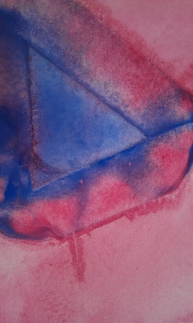
I have a project where I need to design a wine label using watercolour medium. Here are some different looks I achieved painting with random objects!

Thursday, March 7, 2013

Nov. 12, 1955. 10:04pm

Here is another t-shirt design I just finished recently. I had the word 'storm' to come up with some inspiration. After some brainstorming (ha!) a scene from Back to the Future came into my mind. It's the scene where Doc Brown first discovers time travel!


Rise and fall of town square
The area around the courthouse was developed in the following seventy years and by the 1950s had become the downtown of Hill Valley. A grass-covered town square was built in front of the courthouse, while stores, theatres and cafés opened on the surrounding streets. On Saturday, November 12 1955, at 10:04 p.m. PST, lightning struck the courthouse's clock tower, freezing the clock at 10:04. The clock was never repaired and as it became a landmark of Hill Valley over the years, it was preserved in its non-functional state by the Hill Valley Preservation Society.
I decided I wanted to incorporate the clock tower, and give the effect of lighting and smoke. I also really wanted to add Marty McFly!

I came across a photo of Marty, so beginning I cut him out with a mask, using a colour halftone effect. You can get different effects with this filter if you use different values. You can also use selections in quick mask mode to get different effects!

marty2

I then played with some other filter effects on the picture, to give it some more texture.

marty

I found a font that was based on the title lettering from the movie, so I used that to add Marty's catch phrase. That's heavy, Doc! I used the same colour halftone technique as I did on the picture.

marty3

I wasn't sure what to add in the background, so I tried some different shapes. Even a silhouette of the time machine!

marty4

marty5

I decided I didn't really like where it was going, so I said goodbye to Marty and sent him back to the future. I chose to go with a clock in the background and keep it the main element. I began by drawing a couple of circles.

clock1

Then I added some hands in, of course at 10:04!

clock2

I copied the now merged circles and filled it with an aqua colour. Then I added a strong gaussian blur effect. I tried an outer glow effect but it wasn't as spread out as I wanted it to be.

clock3

I brought my text in from my previous idea, made some minor alignment adjustments and added a slight drop shadow for more depth.

text1

I copied the text layers and changed the colour, to give the text more substance.

text2

I used a smoke brush to begin a lighting strike effect.

smoke

Then I added the lighting with a brush as well.

lightning

I used the same lighting brush to add a cracked effect to the clock.

cracks

Finally I added a texture overlay to bring the design together fully.

texture

And that's my final design!

shirt-mockup

I really like how it came out! Mostly the colour scheme and the effect of the text.

Always hit it to 88 miles per hour! :)

Friday, March 1, 2013

In space, nobody can hear you meow.

Here's a little design I made to experiment with some blending and colour halftone techniques in Photoshop. I wanted to play with geometric elements as well.

Yes, that's my cat, Willow Pillow.

AlisonKeba_personaltech

Enjoy! :)

The Making of John Mayer's Born and Raised

Here is an 18 minute film by Danny Cooke documenting the creation of John Mayer's Born and Raised album artwork. Mayer works with a multi-talented artist from England, Dave Smithto create a unique and elegant design for Mayer's fifth studio album. You can see immediately from visiting his website how he has a precise eye and a love for Victorian style art and design. This film breaks down the process from video chats between Mayer and Smith, to elaborate preliminary sketches for small details within the album cover. You can also watch as Smith works on some personal glass signs for Mayer, seeing how much work and patience go into such wonderful pieces.

Oh, and there is also a REALLY cute pug that makes a guest appearance. Enjoy and please share!


Source.