Rise and fall of town squareI decided I wanted to incorporate the clock tower, and give the effect of lighting and smoke. I also really wanted to add Marty McFly!
The area around the courthouse was developed in the following seventy years and by the 1950s had become the downtown of Hill Valley. A grass-covered town square was built in front of the courthouse, while stores, theatres and cafés opened on the surrounding streets. On Saturday, November 12 1955, at 10:04 p.m. PST, lightning struck the courthouse's clock tower, freezing the clock at 10:04. The clock was never repaired and as it became a landmark of Hill Valley over the years, it was preserved in its non-functional state by the Hill Valley Preservation Society.
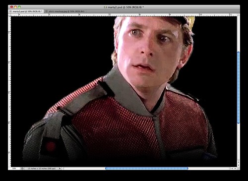
I came across a photo of Marty, so beginning I cut him out with a mask, using a colour halftone effect. You can get different effects with this filter if you use different values. You can also use selections in quick mask mode to get different effects!

I then played with some other filter effects on the picture, to give it some more texture.
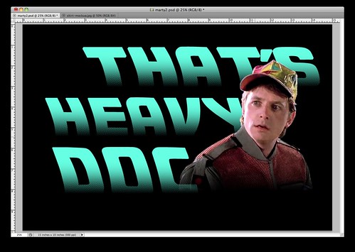
I found a font that was based on the title lettering from the movie, so I used that to add Marty's catch phrase. That's heavy, Doc! I used the same colour halftone technique as I did on the picture.
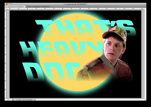
I wasn't sure what to add in the background, so I tried some different shapes. Even a silhouette of the time machine!

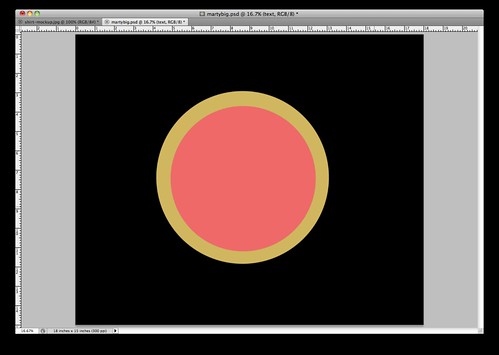
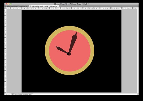
I decided I didn't really like where it was going, so I said goodbye to Marty and sent him back to the future. I chose to go with a clock in the background and keep it the main element. I began by drawing a couple of circles.
Then I added some hands in, of course at 10:04!
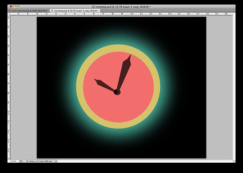
I copied the now merged circles and filled it with an aqua colour. Then I added a strong gaussian blur effect. I tried an outer glow effect but it wasn't as spread out as I wanted it to be.
I brought my text in from my previous idea, made some minor alignment adjustments and added a slight drop shadow for more depth.
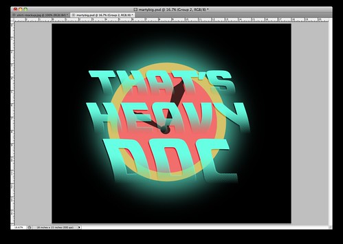
I copied the text layers and changed the colour, to give the text more substance.
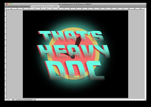
I used a smoke brush to begin a lighting strike effect.

Then I added the lighting with a brush as well.

I used the same lighting brush to add a cracked effect to the clock.

Finally I added a texture overlay to bring the design together fully.

And that's my final design!

I really like how it came out! Mostly the colour scheme and the effect of the text.
Always hit it to 88 miles per hour! :)
No comments:
Post a Comment