Sunday, April 14, 2013

Urban Behaviour

Hello! Another work in progress is here. This time it's inspired by the word 'urban'. When I think of urban, I think of graffiti, hip hop and bold design. I chose to incorporate Vanilla Ice into the mix because I've had Ninja Rap stuck in my head for days. Now it's your turn!


And here is a little info on the American rapper also known as Robert Van Winkle:
Robert Matthew Van Winkle (born October 31, 1967), known professionally as Vanilla Ice, is an American rapper. Born in South Dallas, and raised in Texas and South Florida, Van Winkle released his debut album, Hooked, in 1989 on Ichiban Records, before signing a contract with SBK Records, a record label of the EMI Group which released a reformatted version of the album under the title To the Extreme. Van Winkle's single "Ice Ice Baby" was the first hip hop single to top the Billboard charts.


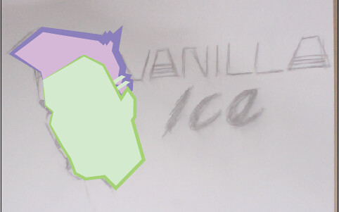
These are some reference images I used. Nice quaff!


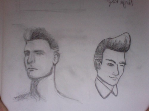
Here are my thumbnail sketches:

Photo on 2013-04-13 at 17.04

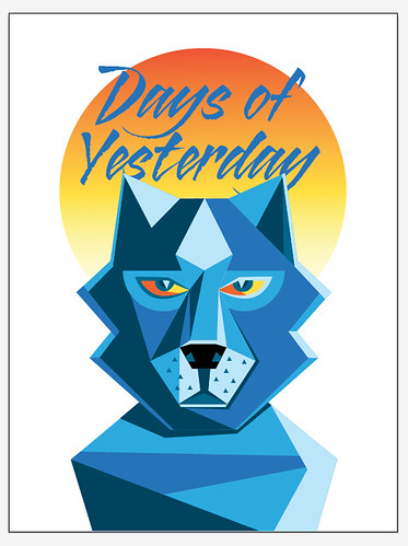
I decided to go with this one:

thumbnailfinal

I started with creating shapes for the hair and head. I added thick and bright strokes to contrast with the pastel fills:

head

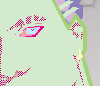
I added more detail in the face, creating shapes for shadows and using the colour halftone effect to add some pattern. I did the same to add a lighter chunk to the hair:

face

I added in more detail with the eye and ears:

eyes

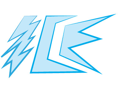
The next step was the text. I decided to go for just 'Ice' instead of the whole name. I created blue shapes with a bolder blue stroke:

ice1

I created a drop shadow effect behind it by copying the letters and changing the colour fill and playing with colour halftone effects again:

ice2

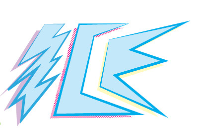
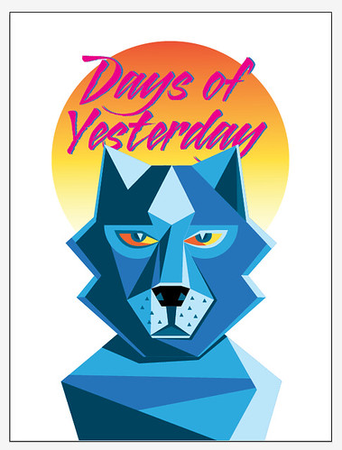
Then I added in green lines to make the text pop out more. This is the final design:

icefinal

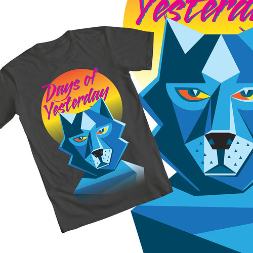
And here it is mocked up on a light blue t-shirt!:

urban-tshirtmockup

I'm pretty happy with the overall design. I think I am going to continue with the stylized portraits and see what I can do with them! Until next time! :)

Wednesday, April 10, 2013

Jurassic Times

Hello readers! Another work in progress is here! This time we are going back to the Mesozoic era (sort of) with a Jurassic Park themed design, inspired by the word "egg"! Here is a little back story of the 1993 movie:
Steven Spielberg's phenomenally successful sci-fi adventure thriller is graced by state-of-the-art special effects from the team of Stan Winston, Phil Tippett and Michael Lantieri from George Lucas's Industrial Light & Magic. The film follows two dinosaur experts -- Dr. Alan Grant (Sam Neill) and Dr. Ellie Sattler Laura Dern) -- as they are invited by eccentric millionaire John Hammond (Richard Attenborough) to preview his new amusement park on an island off Costa Rica. By cloning DNA harvested from pre-historic insects, Hammond has been able to create living dinosaurs for his new Jurassic Park, an immense animal preserve housing real brachiosaurs, dilophosaurs, triceratops, velociraptors, and a Tyrannosaur Rex. Accompanied by cynical scientist Ian Malcolm (Jeff Goldblum), who is obsessed with chaos theory, and Hammond's two grandchildren (Ariana Richards and Joseph Mazzello), they are sent on a tour through Hammond's new resort in computer controlled touring cars. But as a tropical storm hits the island, knocking out the power supply, and an unscrupulous employee (Wayne Knight) sabotages the system so that he can smuggle dinosaur embryos out of the park, the dinosaurs start to rage out of control. Grant then has to bring Hammond's grandchildren back to safety as the group is pursued by the gigantic man-eating beasts.


As I was trying to think of a design to mend eggs and Jurassic Park, I decided to revamp the logo from the first movie creating a prequel concept logo, inspired by dinosaur eggs! The prequel movie in my mind would be about before the scientists created the park, and how they came about the idea to clone the dinosaurs. Here is a scene from the movie, as well as some reference images for my inspiration!


Here is the original logo:


And here are some reference images I used:


This is my final choice of thumbnail. I wanted to keep the 'silhouette' style of the original logo as well as the same style of text:

thumbnail

I started out with the base, using the shape tool in Illustrator:

base

Then I traced the outline of the baby dinosaur, creating a shape with the pen tool. I added red strokes as lines to show the detail in the body and face:

dino

I then added the cracked opening of the egg, creating a yellow shape with black strokes for detail:

eggcrack

I then added in the title text. The typeface is called "African" and I downloaded it for free HERE. The type didn't look exactly like the logo text, so I created outlines of the text and adjusted the shapes with the move tool.

text

Lastly for the design was the subtitle, the red strokes inside the text and the yellow "stroke" on the text block. I actually placed a yellow shape behind the red and black base shapes:

strokes

And here it is on a t-shirt mock-up! I wanted to try a coloured shirt this time, and I think the green goes well with the colours of the logo.

egg-tshirtmockup

Keep locked in for more exciting things soon! :)

Tuesday, March 26, 2013

Days of Yesterday

Hello readers! Here is my next work in progress entry, based on the Illustration Friday word 'yesterday'. When I was trying to come up with ideas for this design, nothing very specific came to mind. So I decided to go with the idea of the days of yesterday. I've been told I'm a throwback kind of girl, so I made an 80's themed design! So with that idea, I thought of what kind of content was present in the 1980's. What came to mind was wolves! They were on t-shirts, posters, album covers, the side of that one guy's van, etc.

Here is my sketch to start my design:

sketch

I started with the body, using different hues of blues to create my design. I really like using shapes to create illustrations, creating hard edges and making it look geometric, which was very prominent for graphic design in the 1980's.

body

Then I went on to start the head, following along quite close to the template.

head1

I started to add detail to the face, such as where they eyes were going to go and the snout.

head2

Here I added in definition for the snout, like the nose and mouth.

head3

The last step for the wolf was the eyes. I used yellow and orange (complimentary to blue) so they would pop!

head4

The next step was to add more to the background. I used a gradient ellipse to make a sun effect, using the same yellow and orange I used for the eyes.

sun

I added in 80's style text, kind of like a rough calligraphy style called 'Blazing Italic' It's a free font you can download from Tack-O-Rama. They have lists of retro fonts you can choose and download from!

text1

I then copied the text, changing the colour to magenta to give it more dimension.

text2

And that's it! I decided to use a gray shirt this time. I still wanted it to stand out on the t-shirt but I wanted to do something different than black.

t-shirt-mockup

Thanks for reading! 'Til next time! :)

Sunday, March 10, 2013

Watercolour experiments

I have a project where I need to design a wine label using watercolour medium. Here are some different looks I achieved painting with random objects!

Thursday, March 7, 2013

Nov. 12, 1955. 10:04pm

Here is another t-shirt design I just finished recently. I had the word 'storm' to come up with some inspiration. After some brainstorming (ha!) a scene from Back to the Future came into my mind. It's the scene where Doc Brown first discovers time travel!


Rise and fall of town square
The area around the courthouse was developed in the following seventy years and by the 1950s had become the downtown of Hill Valley. A grass-covered town square was built in front of the courthouse, while stores, theatres and cafés opened on the surrounding streets. On Saturday, November 12 1955, at 10:04 p.m. PST, lightning struck the courthouse's clock tower, freezing the clock at 10:04. The clock was never repaired and as it became a landmark of Hill Valley over the years, it was preserved in its non-functional state by the Hill Valley Preservation Society.
I decided I wanted to incorporate the clock tower, and give the effect of lighting and smoke. I also really wanted to add Marty McFly!

I came across a photo of Marty, so beginning I cut him out with a mask, using a colour halftone effect. You can get different effects with this filter if you use different values. You can also use selections in quick mask mode to get different effects!

marty2

I then played with some other filter effects on the picture, to give it some more texture.

marty

I found a font that was based on the title lettering from the movie, so I used that to add Marty's catch phrase. That's heavy, Doc! I used the same colour halftone technique as I did on the picture.

marty3

I wasn't sure what to add in the background, so I tried some different shapes. Even a silhouette of the time machine!

marty4

marty5

I decided I didn't really like where it was going, so I said goodbye to Marty and sent him back to the future. I chose to go with a clock in the background and keep it the main element. I began by drawing a couple of circles.

clock1

Then I added some hands in, of course at 10:04!

clock2

I copied the now merged circles and filled it with an aqua colour. Then I added a strong gaussian blur effect. I tried an outer glow effect but it wasn't as spread out as I wanted it to be.

clock3

I brought my text in from my previous idea, made some minor alignment adjustments and added a slight drop shadow for more depth.

text1

I copied the text layers and changed the colour, to give the text more substance.

text2

I used a smoke brush to begin a lighting strike effect.

smoke

Then I added the lighting with a brush as well.

lightning

I used the same lighting brush to add a cracked effect to the clock.

cracks

Finally I added a texture overlay to bring the design together fully.

texture

And that's my final design!

shirt-mockup

I really like how it came out! Mostly the colour scheme and the effect of the text.

Always hit it to 88 miles per hour! :)